Skip to content
GFM Asset Management
  • About
  • Contact
  • FAQ
  • Platforms
    • 🌐 Interactive Brokers
    • πŸ‡­πŸ‡° iFast
    • πŸ‡¨πŸ‡­ Private Bank Accounts
    • πŸ‡ΊπŸ‡Έ Altruist
    • πŸ‡ΊπŸ‡Έ Vanguard
  • Retirement Plans
    • πŸ‡ΊπŸ‡Έ 401(k) plans
    • πŸ‡ΊπŸ‡Έ 529 college savings
    • πŸ‡ΊπŸ‡Έ IRA (Traditional & Roth)
    • πŸ‡ΊπŸ‡Έ HSA health savings
    • πŸ‡­πŸ‡° ORSO
Search
GFM Asset Management
Close menu
  • About
  • Contact
  • FAQ
  • Platforms
    • 🌐 Interactive Brokers
    • πŸ‡­πŸ‡° iFast
    • πŸ‡¨πŸ‡­ Private Bank Accounts
    • πŸ‡ΊπŸ‡Έ Altruist
    • πŸ‡ΊπŸ‡Έ Vanguard
  • Retirement Plans
    • πŸ‡ΊπŸ‡Έ 401(k) plans
    • πŸ‡ΊπŸ‡Έ 529 college savings
    • πŸ‡ΊπŸ‡Έ IRA (Traditional & Roth)
    • πŸ‡ΊπŸ‡Έ HSA health savings
    • πŸ‡­πŸ‡° ORSO
GFM Asset Management
Search Toggle menu

Tag: charts

July 25, 2019Charts

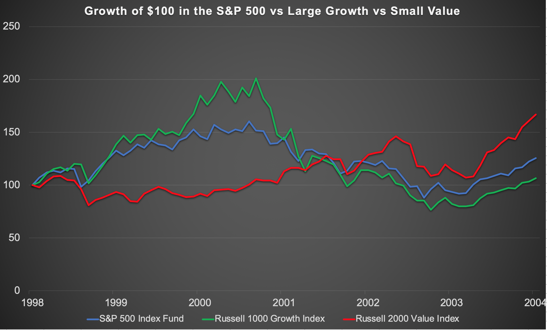
Value like it’s 1999

40 years ago, in 1979, BusinessWeek published its now infamous cover “The Death of Equities“, after one of the worst decades for […]

July 25, 2019July 25, 2019Charts

Vanguard Growth Underperformed the S&P 500 Over 40 Years

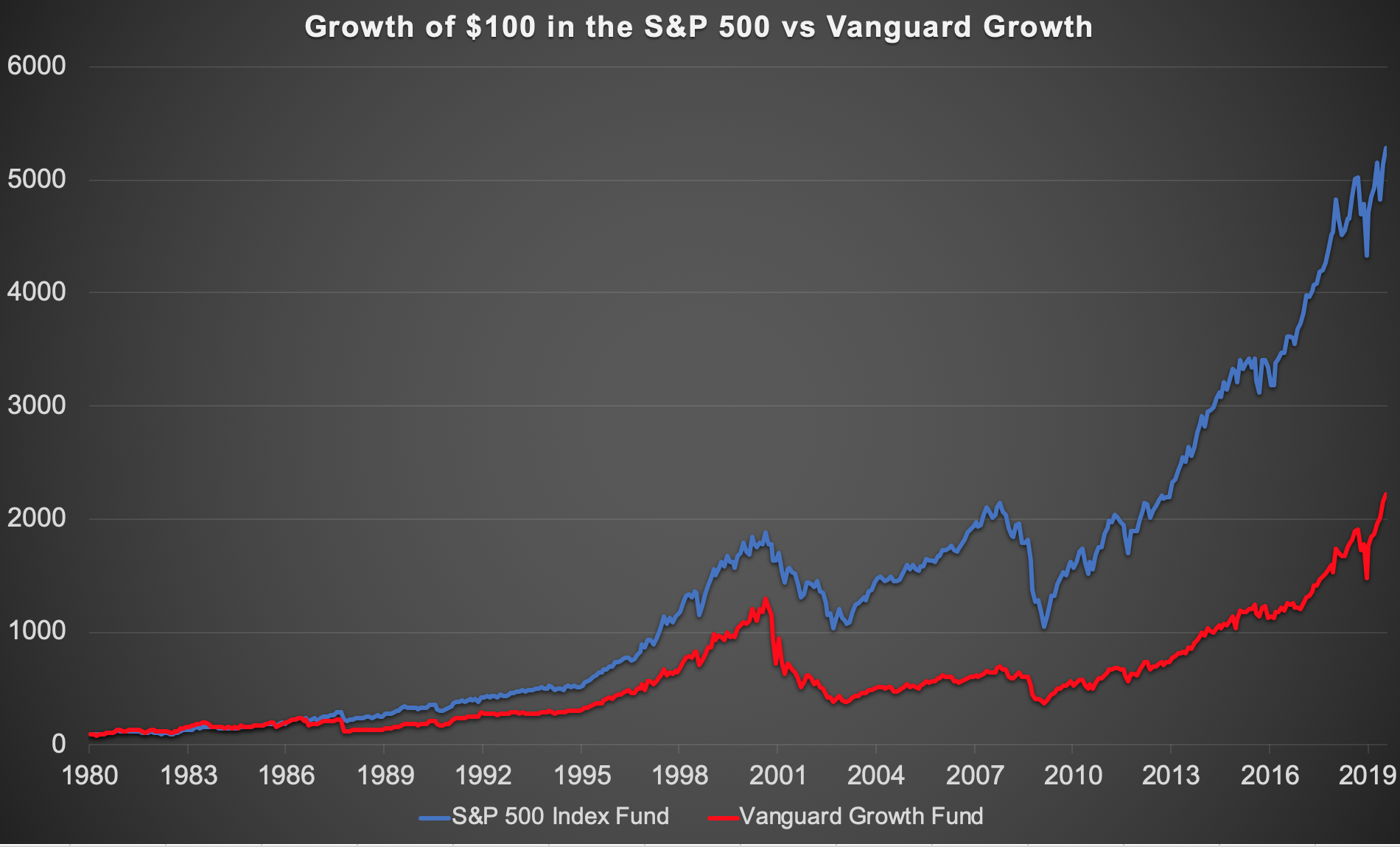
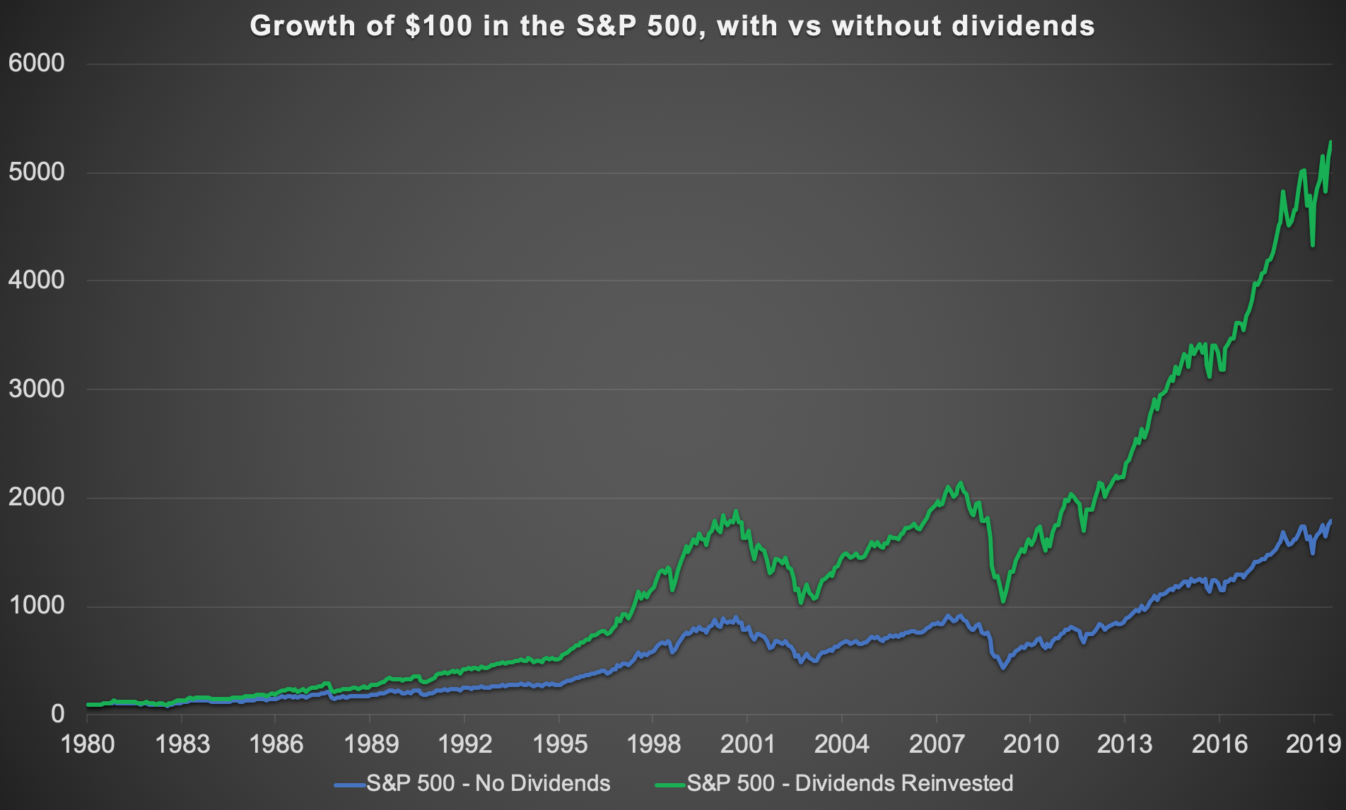
Following the last post’s chart showing how 75% of the returns investing in the S&P 500 came from dividends, this chart by […]

July 25, 2019Charts

75% of S&P 500 Returns Come From Dividends: 1980-2019

In the short term, stock returns are dominated by the ups and downs of price movements, in the long run, stock returns […]

Are stocks cheap yet?
January 3, 2019Charts

Are stocks cheap yet?

Stock markets ended 2018 with what some call a sharp correction, and others call a minor crash. Last month, the S&P 500 […]

Long term stock returns vs bond returns by country
November 6, 2018May 28, 2019Books, Charts

13 Thought-provoking charts from “Stocks for the Long Run”

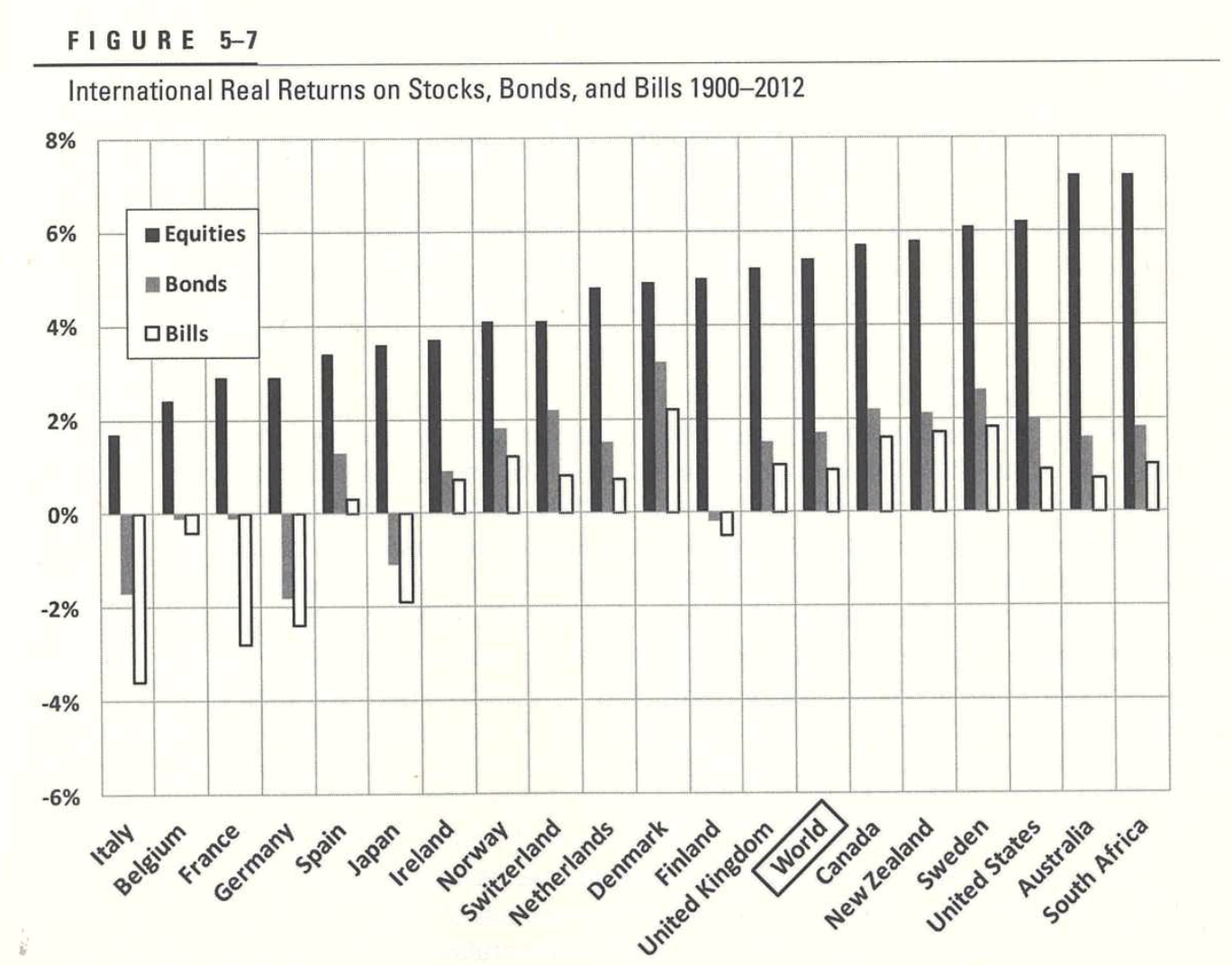
I recently re-read the 5th edition of Jeremy Siegel‘s classic book Stocks for the Long Run, and thought it would be worth […]

June 30, 2017Web finds

Beer consumption slowing down globally, even in China

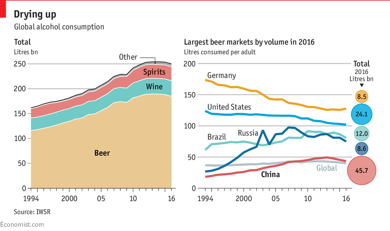
One of my favorite charts earlier this week was from this Economist article about declining global beer consumption. Β Earlier this year I […]

December 19, 2016Books, Education, Investing

A 63-year chart of US Interest Rates and the 35-year old bond bull market

I love long-term charts, and recently started re-reading the 5th edition of Jeremy Siegel’s classic “Stocks for the Long Run“. Β Being naturally […]

December 16, 2016Education

How different were the German Mark, French Franc, and Italian Lire before the Euro?

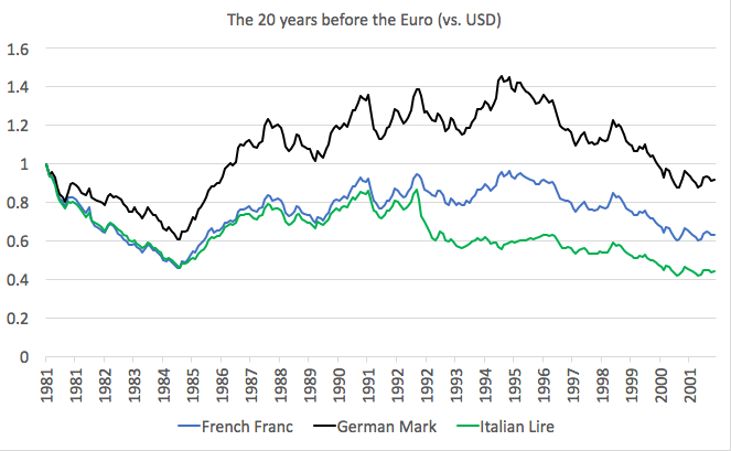
Yesterday I posted a 45-year historical chart of 9 currencies where I described the difference between appreciators, depreciators, and long-term range-bound currencies. […]

Map of world's largest stock exchanges over US$1 trillion
February 22, 2016February 22, 2018Charts, Web finds

The world’s largest stock exchanges mapped by VisualCapitalist

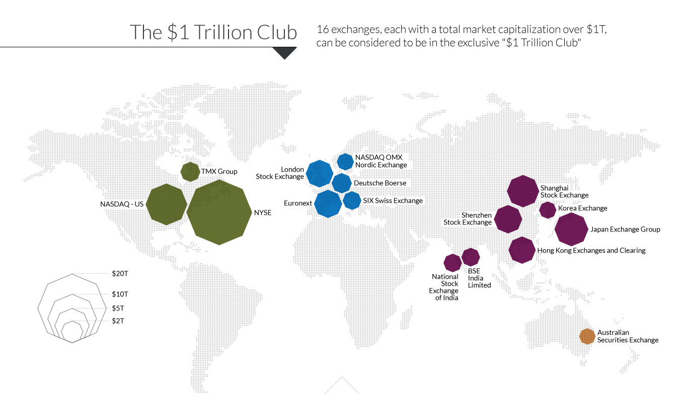
VisualCapitalist published some fascinating maps about the world’s largest stock exchanges, showing the relative size of the major 5 “JUICE” markets (Japan, […]

Size of Stock Market vs Bond Market
February 22, 2015February 22, 2018Web finds

Size of Stock Market vs Bond Market

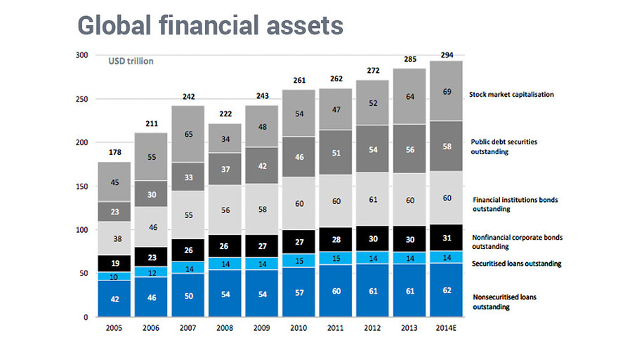
MarketWatch posted this bar chart showing the relative size of stock market vs bond market assets by category as of 2014.Β  Roughly, […]

Posts pagination

< 1 2 3 >
© 2025 GFM Asset Management. Proudly powered by Sydney
 

Loading Comments...