Skip to content
GFM Asset Management
  • About
  • Contact
  • FAQ
  • Platforms
    • 🌐 Interactive Brokers
    • πŸ‡­πŸ‡° iFast
    • πŸ‡¨πŸ‡­ Private Bank Accounts
    • πŸ‡ΊπŸ‡Έ Altruist
    • πŸ‡ΊπŸ‡Έ Vanguard
  • Retirement Plans
    • πŸ‡ΊπŸ‡Έ 401(k) plans
    • πŸ‡ΊπŸ‡Έ 529 college savings
    • πŸ‡ΊπŸ‡Έ IRA (Traditional & Roth)
    • πŸ‡ΊπŸ‡Έ HSA health savings
    • πŸ‡­πŸ‡° ORSO
Search
GFM Asset Management
Close menu
  • About
  • Contact
  • FAQ
  • Platforms
    • 🌐 Interactive Brokers
    • πŸ‡­πŸ‡° iFast
    • πŸ‡¨πŸ‡­ Private Bank Accounts
    • πŸ‡ΊπŸ‡Έ Altruist
    • πŸ‡ΊπŸ‡Έ Vanguard
  • Retirement Plans
    • πŸ‡ΊπŸ‡Έ 401(k) plans
    • πŸ‡ΊπŸ‡Έ 529 college savings
    • πŸ‡ΊπŸ‡Έ IRA (Traditional & Roth)
    • πŸ‡ΊπŸ‡Έ HSA health savings
    • πŸ‡­πŸ‡° ORSO
GFM Asset Management
Search Toggle menu

Category: Charts

May 31, 2021Charts

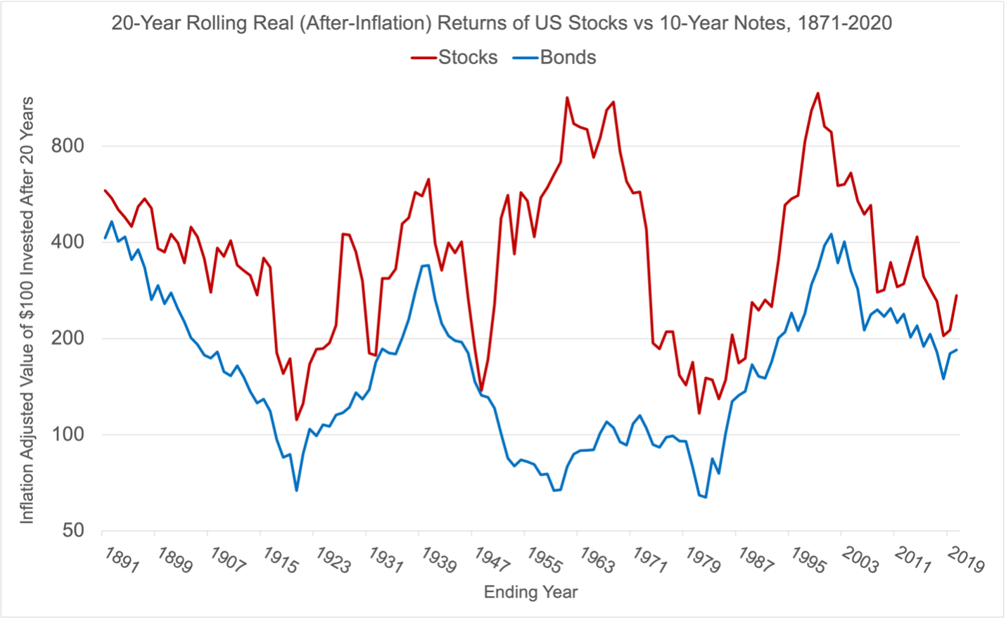
Quick Chart: 20-Year Rolling Returns of Stocks vs Bonds

Bonds may be safer than stocks in the short term, but they can actually be riskier in the long term. This is […]

August 11, 2020Charts

How the World Has Changed Since 1987

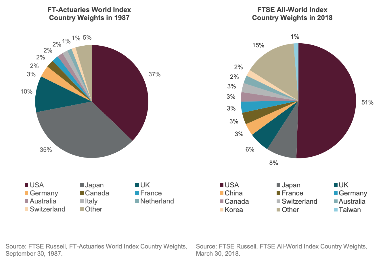
Today’s chart was a quick visual reminder to me on how the world has changed since 1987 – namely, how it has […]

Dividend Growth For Higher Returns
August 3, 2020Charts

Dividend Growth For Higher Returns And Lower Risk, Long Term

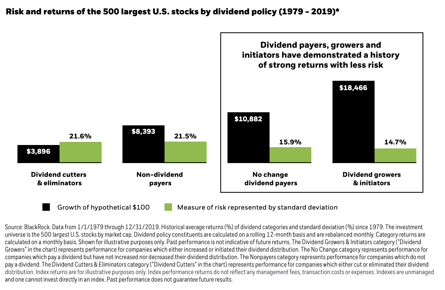
Today’s chart comes from the ETF giant BlackRock iShares, where in their guide to dividend investing with ETFs, they include on page […]

German vs European Stock Returns since 1970
July 2, 2020Charts

German vs European Stock Returns since 1970

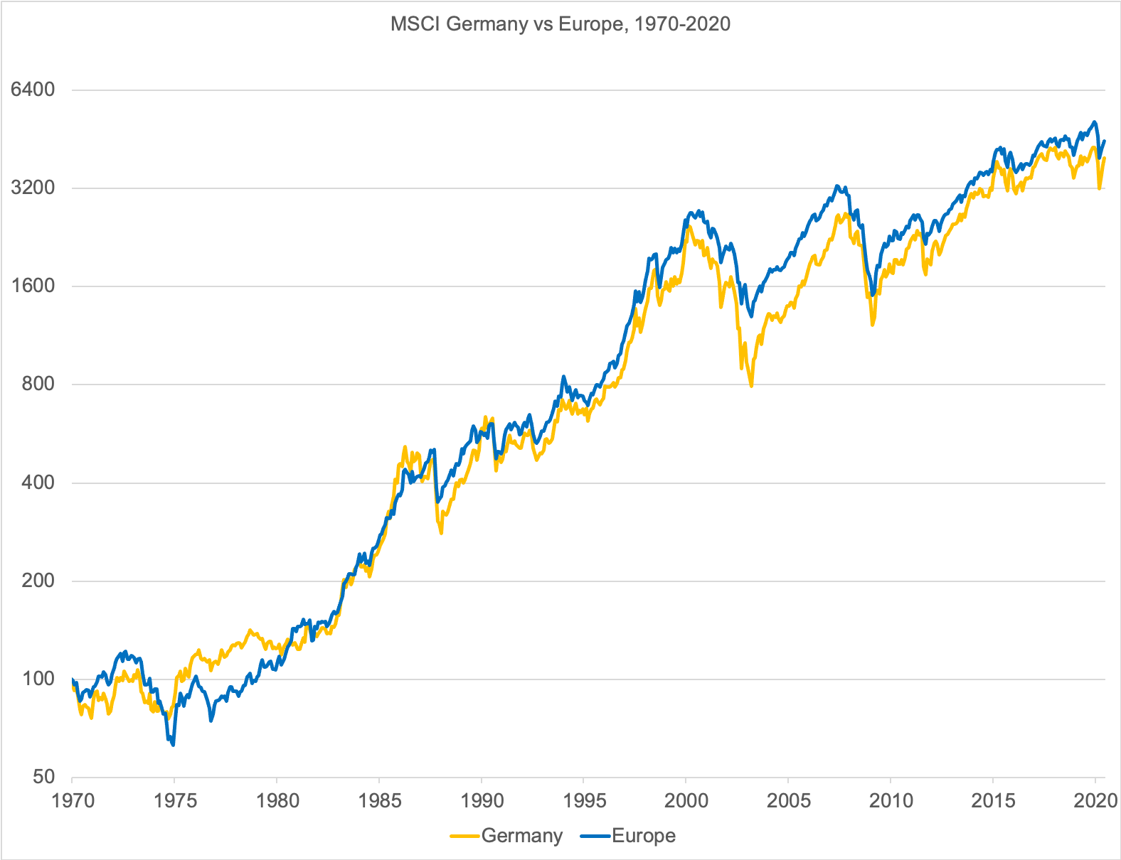
Today’s chart is a quick plot of German vs European Stock Returns since 1970, denominated in EUR, based on MSCI gross dividend […]

April 17, 2020Charts

What 150 Years Of Market Crashes Teaches Long-term Investors

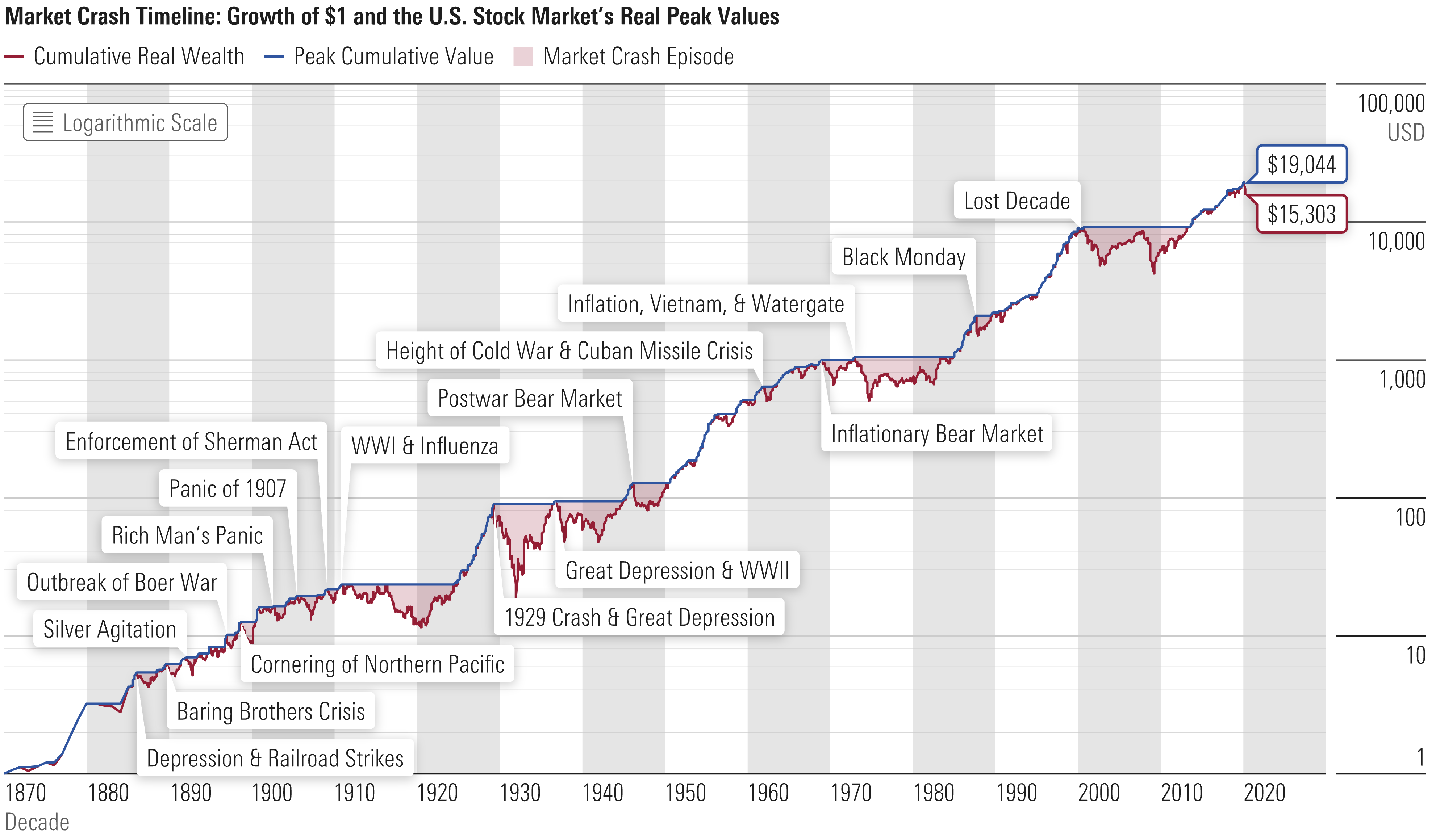
One of the most frequently asked questions I have heard mostly over the past month is “how long will markets take to […]

January 16, 2020January 15, 2020Charts

US Stocks More Expensive than 1999-2000 DotCom Bubble High, According to EV/EBITDA

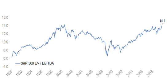
Today’s chart is thank’s to this tweet by the People’s Hedge Fund Manager, showing the EV/EBITDA valuation ratio of the S&P 500 […]

S&P 500 Low Volatility Factor 1972-1990
January 16, 2020January 14, 2020Charts

Lower Risk, Higher Returns

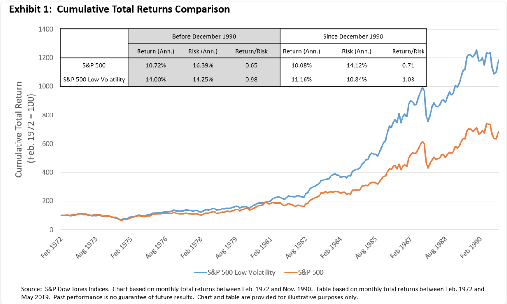
Today’s chart comes from one of the top 10 blog posts of S&P Dow Jones Index’s Indexology blog, showing how the low […]

Economic profit by industry, 2010-2014
January 15, 2020January 14, 2020Charts, Uncategorized

Some industries really are more profitable than others

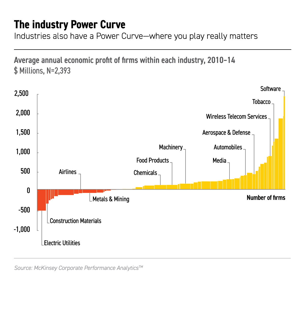
One of the concepts in academic economics which seems to obviously false in the real world is the idea that firms in […]

Stock Markets by Country 1899 vs 2019
January 14, 2020January 13, 2020Charts, Investing, Wealth Management

119 Years of Investment Returns, According to Credit Suisse

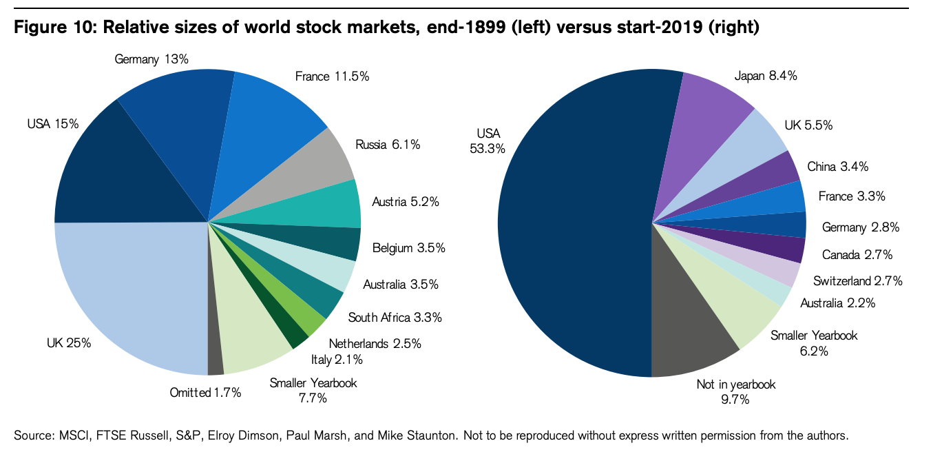
This morning’s ferry read is the Credit Suisse Global Investment Returns Yearbook 2019, for which I have to thank this excellent Twitter […]

Performance of Stocks vs Bonds vs 60/40 in Japan, USD net terms, 1984-2019
January 13, 2020Charts

60/40 Has Worked Well, Even in Japan

One of the most memorable lines I heard from my professors back at UC Berkeley was “what I am about to teach […]

Posts pagination

1 2 3 >
© 2025 GFM Asset Management. Proudly powered by Sydney
 

Loading Comments...