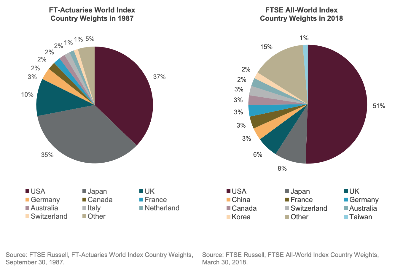
Today’s chart was a quick visual reminder to me on how the world has changed since 1987 – namely, how it has become significantly more American and significantly less Japanese. The source is a FTSE Russell paper titled “Indexing The World”, which index geeks like me would consider required reading for understanding the difference between FTSE vs MSCI benchmarks in a global ETF portfolio.
What I find just as surprising about an index as important as this is how China still has less weight than Japan or the UK, despite the middle kingdom now having a larger economy, stock, and bond market than either of the former two, and perhaps greater than both combined on some measures. Others may also find it encouraging that the “other” category of countries has tripled over the same 30 years, indicating a larger opportunity set beyond just these top 10-11 markets.


