I recently re-read the 5th edition of Jeremy Siegel‘s classic book Stocks for the Long Run, and thought it would be worth snapping the following 13 thought-provoking charts for reference. Of course, this is just my summary, and I expect to continue having to refer back to the book for more re-reads.
Chart 1: US home prices have mostly tracked inflation, except for a few bubbles
Real estate (aka property) is often considered one of the best hedges against inflation, as the simplest way to protect against rising home prices is to simply own the house you live in. This idea is the basis of the “4 House Retirement Plan“, and taken literally by some investors, especially in Asia. Property prices tend to outpace inflation over short periods for one of two reasons: a.) urbanization, and b.) increasing mortgage credit, but as the chart below shows, real estate prices broadly track inflation long-term. I have also posted another chart comparing 10 different countries’ property markets (including the US’s) vs stocks.

Chart 2: Property Prices vs Median Incomes in the US

Chart 3: Global stocks have become more correlated with each other and with commodities, but inversely correlated with bonds

Chart 4: The big shift in the world economy 1980-2100 is a decline in Europe and Japan and the rise of China and India

Chart 5: US Stocks have outperformed US bonds in every 30 year period since 1850, though neared zero again in the Great Depression of the 1930s and the GFC of 2008-2009

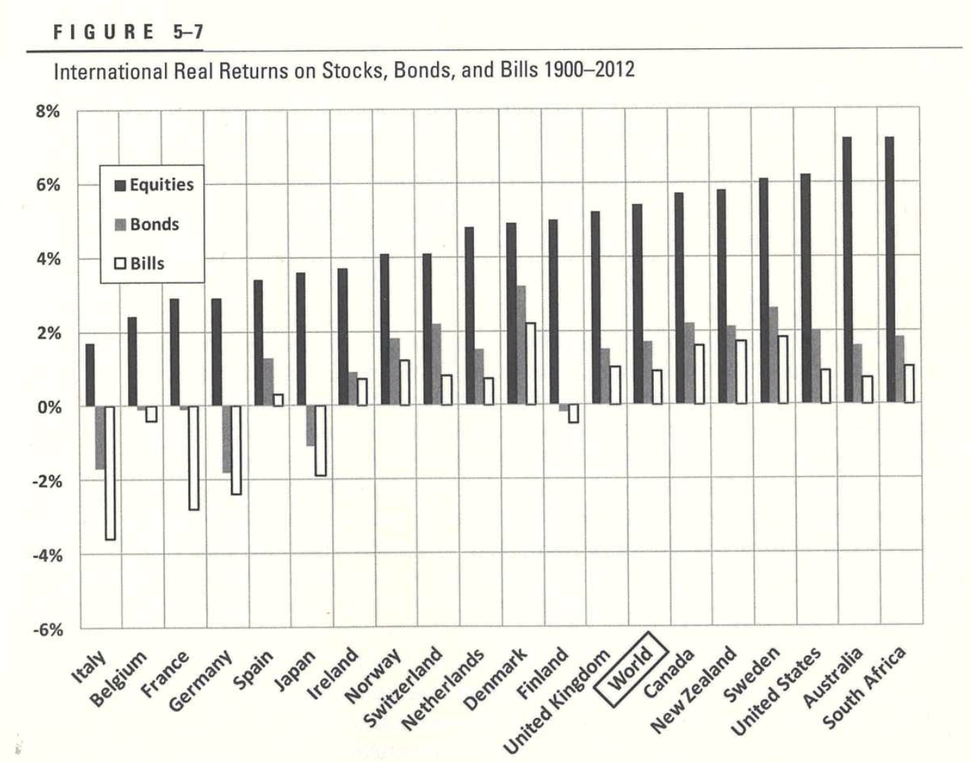
Chart 6: Stocks have outperformed bonds in every country studied

Chart 7: Stock returns have mean-reverted long-term, making stocks less risky than bonds over >20-30 year time horizons
The random walk dashed bars are what is predicted by a “random walk” model, often used in classic “mean variance” portfolio optimization calculations. This chart argues against mean variance optimization and instead suggests 100% stock allocations have worked best longer-term, especially if you can buy more when stocks are cheap.

Chart 8: The US stock market went from 25% to 5% materials, and from 3% to 33% financials + IT

Chart 9: Philip Morris / Altria has been by far the best performing stock in the S&P 500 since 1957

Chart 10: 10 of the top 20 performing stocks overall have been bought by tobacco companies

Chart 11: IPOs, on average, have consistently lost money for investors

Chart 12: The US remains almost half of world market cap, JUICE totalling around 2/3 of global market cap

Chart 13: High growth has meant low stock returns and vice versa, in both developed and emerging markets
This may be the most surprising chart to many, but is one of the main reasons I tend to stay away from growth when choosing investments and focus more on valuation.


2 thoughts on “13 Thought-provoking charts from “Stocks for the Long Run””
Comments are closed.